For many years, interior design trends favored a highly restrained palette. Minimalist grays, bright whites, and subtle beiges dominated residential spaces, serving as safe choices that appealed to the masses. While neutral tones provide a clean canvas, they can sometimes lack personality and emotional depth.
Recently, a major shift has occurred in the design landscape. Homeowners and designers are moving away from sterile environments and embracing the transformative power of deep, saturated, and highly vibrant hues. Moving past standard neutrals allows you to establish a definitive mood, redirect architectural focus, and instill individual character into a home.
However, using striking colors successfully requires more than just picking an intense shade from a fan deck and covering four walls. Saturated pigments behave differently than light neutrals, reacting dramatically to lighting changes, spatial dimensions, and surrounding furniture. Achieving a sophisticated look requires a solid understanding of color theory, careful preparation, and strategic balance.
The Psychology and Impact of Intense Palettes
Saturated wall colors do more than alter the appearance of a room; they actively change how the space feels. Light shades bounce light around to make boundaries recede, whereas rich colors absorb light, drawing the walls inward to create an enveloping sensation. This structural illusion can turn an expansive, cold room into an intimate sanctuary or elevate a mundane hallway into an artistic transition space.
Different color families trigger distinct psychological responses that should guide your room choices:
-
Deep Blues and Teals: Shades like navy, indigo, and deep ocean blue invoke feelings of stability, intellect, and profound calm. They are exceptional choices for private spaces such as bedrooms, home offices, and libraries.
-
Rich Greens: Forest green, emerald, and mossy olive ground a space by channeling the natural world. These tones promote rejuvenation and work beautifully in living areas or dining rooms where people gather to unwind.
-
Warm Earth Tones and Jewel Tones: Deep terracotta, burgundy, mustard yellow, and plum bring intense energy and warmth. They stimulate appetite and conversation, making them ideal for dining rooms, entryways, and kitchens.
-
Moody Darks: Charcoal gray, deep chocolate brown, and true black introduce unparalleled drama and architectural definition. When used correctly, they make secondary colors pop and create a high-end, gallery-like feel.
Strategic Approaches to Applying Intense Pigments
You do not have to commit every square inch of a room to a strong color to make a lasting impression. There are several proven design methods for integrating these tones smoothly into your home.
The Dramatic Accent Wall
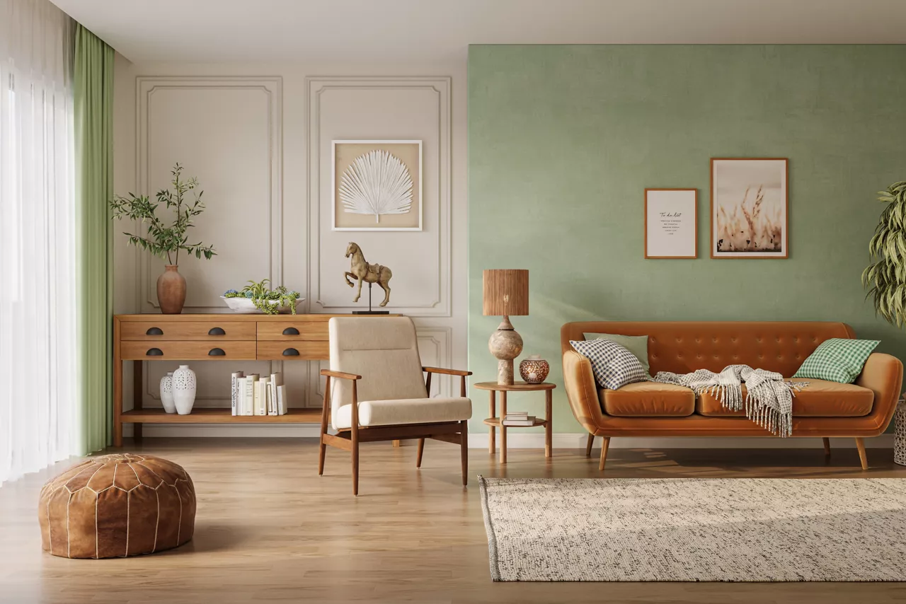
The single accent wall remains an excellent entry point for testing intense colors. The key to making this technique look modern is intentionality. Choose a wall that possesses a natural focal point, such as behind a living room sofa, the headboard wall in a bedroom, or an architectural feature like a fireplace surround. Avoid painting a random wall with no structural anchor, as this can make the room look fragmented rather than cohesive.
Color Drenching for Full Immersion
Color drenching is a sophisticated technique where you paint the walls, baseboards, crown molding, window casings, and sometimes even the ceiling in the exact same saturated shade. Utilizing a single color over multiple surfaces eliminates sharp visual breaks, which actually makes a compact room feel larger and more cohesive. It creates a seamless background where the architectural details are defined by shadow rather than contrasting paint lines.
The Contrasting Half-Wall or Wainscoting
If you are hesitant to apply a deep shade from floor to ceiling, try pairing a rich color with a crisp neutral using a split-wall approach. Painting the bottom half of a wall, chair rails, or decorative wainscoting in a deep charcoal or forest green while keeping the top half a warm alabaster or soft cream anchors the room beautifully. This approach provides the visual weight of a bold color while preserving the brightness of a traditional layout.
Painting Unexpected Architectural Elements
You can use rich colors to draw attention to unique structural details that might otherwise go unnoticed. Consider applying a vibrant hue solely to the interior side of your front door, the inside backs of built-in bookshelves, an arched entryway, or a recessed ceiling tray. This targeted application adds an element of architectural surprise without overwhelming the primary living space.
Mastering Balance with Furniture and Lighting
A strong paint color should never exist in isolation. Its success depends entirely on how it interacts with your lighting, flooring, textiles, and furniture selections.
Navigating the Light Matrix
Lighting is the single most critical factor in how an intense paint color translates in a physical space. Saturated paints absorb light, meaning they require a thoughtful combination of natural and artificial illumination to keep from looking flat or muddy.
-
Natural Light Orientation: North-facing rooms receive cool, bluish light that can make dark colors look colder; choose warm-toned bold options like terracotta or plum to balance this. South-facing rooms enjoy bright, warm light all day, which beautifully handles deep blues, emeralds, and cool charcoal tones.
-
Artificial Layering: Relying on a single overhead light fixture will leave a dark room feeling gloomy. Implement a layered lighting scheme consisting of ambient lighting, task lighting, and accent fixtures like picture lights or wall sconces to create highlights and cast beautiful shadows across the deep walls.
Implementing the 60-30-10 Rule
To maintain visual harmony when working with high-impact color schemes, interior designers frequently employ the 60-30-10 rule. This classic design equation divides the room’s color components into three distinct percentages:
-
60 Percent (The Dominant Tone): This is your main wall color, which sets the overall tone for the environment.
-
30 Percent (The Secondary Tone): This component consists of large furniture pieces, area rugs, window treatments, or wood flooring. It should contrast with or complement the walls to keep the environment balanced. For instance, pairing a light oak floor and cream linen drapes with a dark navy wall.
-
10 Percent (The Accent Tone): This fraction represents smaller accessories like throw pillows, artwork frames, metallic hardware, and small lighting fixtures. This is where you can introduce a complementary pop of brightness, such as brass accents against a deep forest green backdrop.
Essential Technical Tips for Application
Using highly pigmented paint requires careful execution during the application process. Saturated colors carry a higher concentration of colorant, which behaves differently during application than standard white-based interior paints.
-
Never Skip the Primer: Saturated colors require a consistent base coat to achieve full coverage. Always use a high-quality primer, and ask the paint retailer to tint the primer toward your final color. Using a gray-tinted primer instead of plain white ensures you achieve the true depth of the paint shade in fewer coats.
-
Select the Appropriate Sheen: The gloss level of your paint changes how color is perceived. Flat or matte finishes absorb light completely, hiding wall imperfections and providing a velvety texture that looks incredibly sophisticated with deep tones. Eggshell or satin finishes offer a subtle reflection and are much easier to clean, making them better suited for high-traffic hallways, kitchens, and bathrooms. Avoid high-gloss finishes on entire walls, as they create harsh glare points and amplify every slight texture flaw.
-
Invest in Quality Materials: Cheap paint rollers and brushes will leave visible streak marks, lap lines, and uneven pigment distribution when applying dark colors. Use high-quality synthetic rollers and maintain a wet edge while painting to ensure a completely uniform, professional finish across the entire surface.
Frequently Asked Questions
Will painting a small room a dark color make it feel claustrophobic?
Not necessarily. While a light color reflects light to make walls feel more distant, a dark color dissolves the edges of the room because shadows blend into the corners. In small spaces like powder rooms or entryways, a dark color can create a cozy, dramatic jewel-box effect that feels intentional and luxurious rather than cramped.
How can I transition from a bold room into a neutral hallway without it looking jarring?
To create a smooth visual transition, look for a common denominator between the two spaces. You can use a lighter tint of the strong color for the hallway, or choose a neutral paint that shares the same underlying undertone (warm or cool) as your accent color. Keeping the trim color identical across both areas also helps unite the spaces.
Why does my dark paint look patchy and uneven after two coats?
Deep, highly pigmented paints often require three or even four coats to achieve uniform saturation and depth. The high volume of tinting colorants can make the first two coats look streaky or translucent in certain areas. Be patient, allow full drying time between applications, and apply an extra coat to achieve an even finish.
What wood tones work best alongside deep forest green and navy walls?
Deep forest greens and rich navies pair exceptionally well with warm, medium-to-dark wood species like walnut, cherry, and stained oak. The orange and reddish undertones inherent in these woods act as natural complements to cool greens and blues, creating an upscale, classic look. For a more modern vibe, light white oak offers a clean, crisp contrast.
How do I clean scuff marks off a matte dark wall without ruining the paint?
Matte and flat finishes in dark shades are prone to a phenomenon called burnishing, where rubbing the surface polishing the paint and leaves a shiny spot. To clean scuffs, avoid abrasive sponges or harsh chemicals. Use a soft microfiber cloth dampened with warm water and a tiny drop of mild dish soap, then gently blot the area rather than scrubbing vigorously.
How can I test an intense paint color without painting directly on my walls?
Avoid painting small patches directly on your wall, as the existing wall color will distort your perception of the new sample. Instead, purchase large, peel-and-stick paint samples or paint a large piece of poster board. This allows you to move the sample around the room to see how it looks next to your furniture and how it changes under different lighting conditions throughout the day.
Can I use bold colors if I live in a rental apartment with strict rules?
If you cannot paint the walls, you can introduce high-impact color through large-scale removable elements. Consider using peel-and-stick temporary wallpaper, hanging oversized colorful tapestries or large canvases, or investing in expansive area rugs and vibrant velvet furniture pieces to anchor the space with color without violating your lease.